Table of Contents
The Plotting module

With the plotting module, you can explore your track data through a simple, user-friendly interface. As well as those tools available by default, the plotting module also supports certain types of user-defined data, described in the advanced usage section. This functionality allows it to be easily tailored to address bespoke research questions.
Plots generated through the plotting module can also be exported in a variety of formats, each providing different degrees of flexibility and ease of use. At its most powerful, analysed data can be exported and combined externally with other datasets to generate publication-quality plots.
Plot and data selection
Upon opening the plotting module, you will be presented with the following GUI:
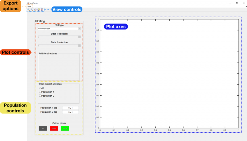
To begin, you will need to select a particular plot type from the plot type drop-down menu. There will be several options available, depending on the analyses that have been performed on the tracks. A full list with descriptions and example plots can be found at the bottom of this page.
Depending on the type of plot selected, you may also need to select the datasets you wish to plot. These are created from the fields in the procTracks data structure, and can be specified from the Data 1 selection and Data 2 selection drop-down menus.
View controls
The view controls function in the same way as in other MATLAB-based figure windows. The magnifying glasses allow you to zoom in on regions of plots, while the hand allows you to pan through the plot. The data cursor is also available, allowing you to measure the values of specific points on the graph.
The final tool is the legend, which will be displayed in the top right-hand corner of the plot. This contains labels for each of your populations (defined in the next section) as well as information about any additional annotations added to the plot.
Population controls
If you have split your tracks into separate populations, you should have access to the population controls at the bottom of the settings panel. These consist of the following:
- Track subset selection: Turn checkboxes on and off to choose which populations should have their data displayed in the current plot.
- Population N tag: Type names for your populations into these boxes to incorporate them into the figure legend (if currently displayed).
- Colour picker: Choose the colour each population should be associated with in the plot.
Plot export options
FAST provides three different ways of exporting your plots, depending on how much you wish to modify them. All three options can be found under the Save menu in the top left hand corner of the plotting panel.
Export figure data
The most flexible option is the Export figure data option. Data associated with the currently visible axes will be saved in the root directory, under the name 'plotDataExport.mat'. This file contains two variables: plotSettings, a list of settings associated with the plotting module at the time the plot was exported, and plotExport.
The contents of plotExport varies depending on the plot type chosen at the point of data export, but in general it consists of a 4×1 cell array containing a separate structure for each object population. Data corresponding to all objects is stored in cell 1, while data corresponding to populations 1, 2 and 3 (if defined) are stored in cells 2, 3 and 4, respectively.
The structures stored within each of these cells are themselves built differently depending on the currently selected plot and the settings currently applied to that plot. For example, with the Timecourse option selected and the Show standard deviation box checked, cell 1 of the plotExport variable will contain three fields, times (the sampled timepoints in physical units), dataMeans (the average value of the chosen track-associated dataset at each timepoint) and dataStd (the standard deviation of the chosen track-associated dataset across all tracks at each timepoint). When Show all tracks is selected in the main GUI however, the times and dataMeans fields of plotExport will be replaced with subTimes and subData, indicating the sampling times and values of each track separately.
Save axes as .fig
You can also save the current set of axes as a standalone figure, which you can then customise using MATLAB's inbuilt figure editing tools. Upon clicking Save axes as .fig in the Save menu, a .fig file will be created in the current root directory called 'plotExport.fig'.
Save axes as .tif
Alternatively, if you are already happy with the way your data looks, you can click Save axes as .tif to export your current plot as a single .tif image. This will be saved in the root directory, under the name 'plotExport.tif'.
The plot types
FAST offers a variety of different plotting options. In this section, examples of each of these plots are given, and descriptions of the associated settings provided.
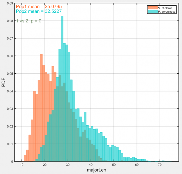
Histograms
Generates histograms for each requested population using the chosen track-associated dataset.
Options:
- Rose plot: Select to display data as a rose plot. Useful for displaying angular data.
- T-test results: Select to display results of t-test comparing selected populations. Results are displayed in top left-hand corner of plot.
- Use track means: Select to average data across entire track duration, generating a single datapoint for each track. Deselect to use data from each timepoint in every track.
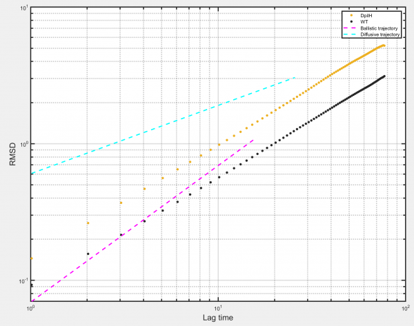
RMSD
Generates a Root Mean Squared Displacement (RMSD) plot for the selected populations. RMSD is simply the square root of the mean squared displacement and allows calculation of values such as the diffusion coefficient D for the ensemble of tracks.
Options:
- Log-log axes: Select to plot data on log-log axes. Deselect to plot data on linear axes.
- Plot ballistic gradient: Select to plot reference line with gradient corresponding to ballistic object motion (= 1 on log-log axes).
- Plot diffusive gradient: Select to plot reference line with gradient corresponding to diffusive object motion (= 0.5 on log-log axes).
- Show sampling: Select to plot RMSD as individual points. Deselect to plot RMSD as a continuous line.
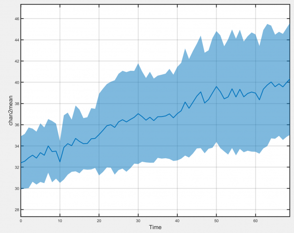
Timecourse
Generates plots of the selected track-associated dataset against time.
Options:
- Show standard deviation: Allows the standard deviation of the chosen track-associated dataset at each timepoint to be displayed.
- Show individual tracks: Select to show all individual tracks centred on the time of the selected event. Deselect to display the mean value at each timepoint instead.
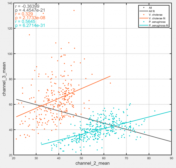
Joint distribution
Generates a scatter plot of the distribution between two track-associated datasets.
Options:
- Show correlation coefficient: Display Pearson's correlation coefficient and associated p-value for selected populations and datasets. Results are shown in top left hand corner of plot.
- Plot linear fit: Display a line of best fit through the data points for the selected populations.
- Show all sampling points: Show all the sampled points for each track, rather than the whole-track average.
- Colour points by local density: Colours each plotted point according to the density of points in the surrounding region, with high-density regions appearing darker and low-density regions appearing brighter. Particularly useful for datasets containing many tracks and for use in conjunction with the 'Show all sampling points' option.
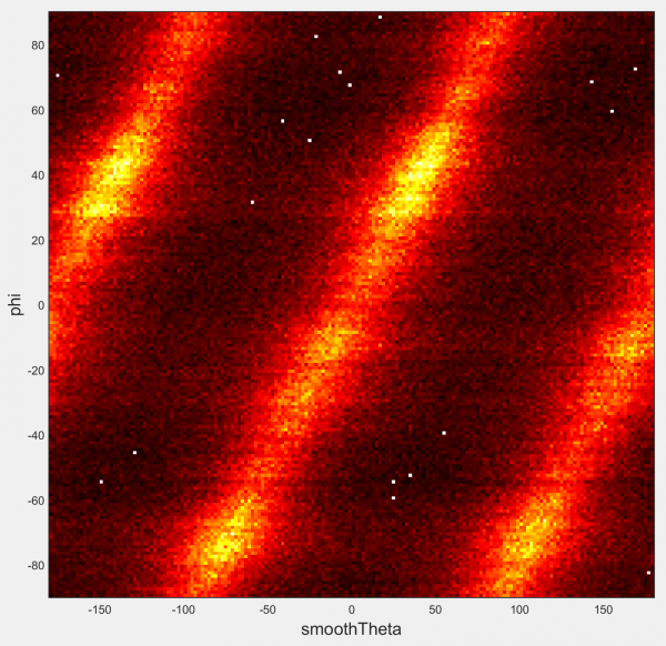
2D histogram
Generates a heatmap of the bivariate distribution between the two indicated track-associated datasets. Similar to Joint distribution, but designed for larger datasets.
Options:
- Show all sampling points: Select to plot each point in every track separately. Deselect to use only the average from across the entire duration of the track.
- X-bin spacing/Y-bin spacing: Define the width of the bins used to construct the heatmap in both dimensions of your dataset.
- Colourmap: Choose the built-in MATLAB colourmap to display your data with.
Not compatible with separate populations.
Phase space
Plots tracks, using arbitrary track-associated variables in place of object position as the axes. Colours track segments according to their time relative to the start of the track, early segments being shaded dark and later segments being shaded light.
This plotting option is similar to the joint distribution and the 2D histogram options. It differs from the joint distribution in that all sampling points in the track are shown, rather than just the track-wide average. It differs from the 2D histogram in that points from a single track are joined together, rather than simply being binned with points from all other tracks.
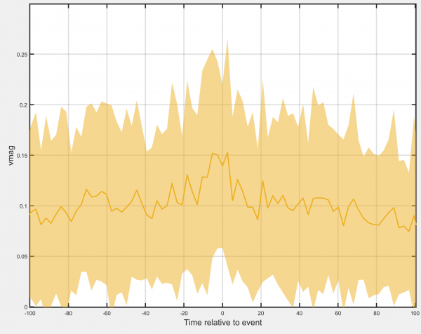
Event-centred average
Generates a timecourse of the track-associated dataset, centred at the times the selected event is detected. Requires that events have been assigned to the tracks.
Options:
- Event class to use: Use this box to choose the number of the event class you currently wish to analyse.
- Show standard deviation: Allows the standard deviation of the chosen track-associated dataset at each timepoint to be displayed.
- Show individual tracks: Select to show all individual tracks centred on the time of the selected event. Deselect to display the mean value at each timepoint instead.
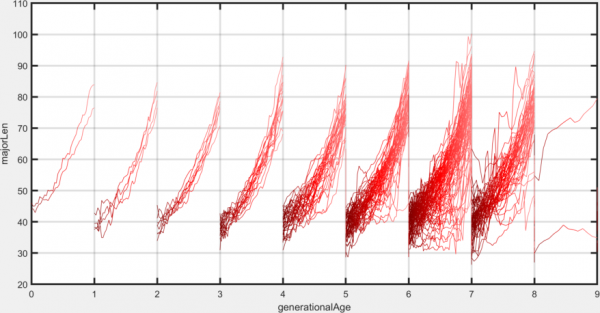
Division-centred average
Generates a timecourse of the chosen track-associated dataset, centred at the time of division. Requires that the division detection module has been applied to the tracks.
Options:
- Show standard deviation: Allows the standard deviation of the chosen track-associated dataset at each timepoint to be displayed.
- Show individual tracks: Select to show all individual tracks centred on the time of cell division. Deselect to display the mean value at each timepoint instead.

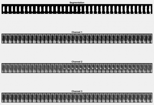
Cartouche
Generates a 'cartouche' by cutting out objects from each timepoint in each image channel and displaying them side by side.
Options:
- Track ID: The ID number of the displayed object. Can be found by checking Show IDs? in the overlays module.
- Start frame: The timepoint in the current track you want display to begin. Measured relative to the start of the track.
- Length: The total number of timepoints you wish to display.
- Align cells?: Select to rotate all objects in the track such that they all point upwards. Deselect to display objects in their native orientation.
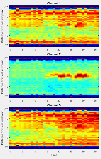
Kymograph
Generates a kymograph (space-time plot) of the selected object in all available channels.
Options:
- Track ID: The ID number of the displayed object. Can be found by checking Show IDs? in the overlays module.
- Equate lengths?: Select to stretch or compress object profiles to ensure that profile length is constant over time. Deselect to display object profiles at native lengths at all timepoints.